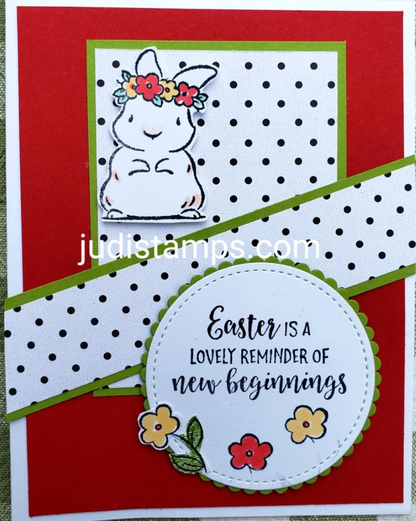
Do you like your Easter colors pastels or bright? I love both! But I will admit I am more of a bright gal myself. The card I am sharing is one I created for a challenge I do in my HapBEE Stampers in Ink Community on Facebook each week.
Members of the community enjoy participating by using what they have to create a card from a sketch that I post weekly. This is a great way to use up the supplies they have and learn new layouts at the same time. If you have extra stamping and paper crafting supplies you want to use up, we invite you to join us here.
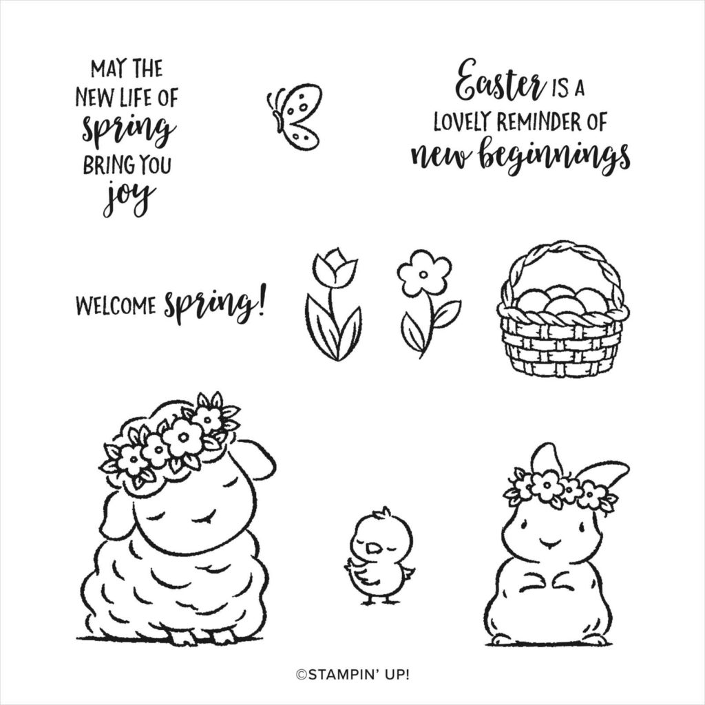
If you regularly follow me, you know I am bringing you Easter cards using the Springtime Joy stamp set (154403) this week. Here is a picture of the set that you can purchase through my online store by clicking here.. Be sure to check our Last Chance Product Sale while there!

Images copyright Stampin’ Up! 1990-2021

I debated on my color palette for this challenge card but decided to go with bright colors. Now don’t get me wrong, it would have been just as adorable in pastels.
I used Real Red, Granny Apple Green and Basic White cardstock. The designer Series Paper is from the Love Always which is filled with all black and white patterns.
I stamped the images using Memento Black and colored with an assortment of Stampin’ Blends.
Do you like your Easter colors pastels or bright?
Now that you’ve seen my card, what color palette would you use? Would you change my card to bright pinks and yellows? If you wanted to use pastels would you go for soft greens & pinks? With either palette you could use the same Designer Series Paper of black and white or change it up to the colors you use. The looks of your cards will be different even though you use the same layout. This card and layout could be a baby or first Birthday card too! Open your window of creativity and you will find the possibilities are endless!


Leave a Reply